

In this article, we’re going to learn how to build a React Drawer component from start-to-finish. We’ll work through several iterations of the component. Finally, we’ll end with something that could be reusable anywhere throughout your application.
What we’re going to build
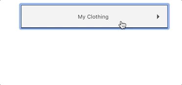
We’re going to be constructing a drawer component. I ran with the Drawer metaphor and placed some clothing in our Drawer. The end feature will look like this:
First, we’ll list out all our high-level feature tasks to complete. This will keep us focused and provide a framework.
- A clickable title that on click expands an attached content section
- Content section that animates like a drawer
- Screen reader compatible tab functionality
With these in mind, let’s get to the actual coding.
Building the basic React Component
The first thing we’ll need is something to store the current state of the Drawer component’s content. This will either be expanded or collapsed to toggle the display of the content inside the drawer. We can use a state variable active to denote this in our component’s constructor. Active just let’s us know if the user has toggled the drawer open or not.
import React from 'react';

class Drawer extends React.Component {
  constructor(props) {
    super(props);

    this.state = {
      active: false,
    };
  }
}

export default Drawer;
So far we have a basic React component but we’re not showing anything to the end-user. We’ll need to craft the HTML necessary within the render method. title will
be a prop directly passed into the component like <Drawer title="Cool title">. This means using our component like this:
<Drawer title="Cool Title">
  <p>hi</p>
</Drawer>
We’re also going to be using the special React prop this.props.children which refers to any
elements that are contained within our component callsite. Specifically, this means that within Drawer the this.props.children prop returns the inner content of <p>hi</p>.
By structuring it in this manner we allow future developers to compose the content they want displayed within the container. It affords a lot of freedom and flexibility in how the component is consumed.
render() {
  return (
    <div className="Drawer">
      <div className="Drawer-title">
        {this.props.title}
      </div>

      <div className="Drawer-content">
        {this.props.children}
      </div>
    </div>
  );
}
The destructuring assignment syntax is a JavaScript expression that makes it possible to unpack values from arrays, or properties from objects, into distinct variables.
developer.mozilla.org
Sprinkle in some assignment destructuring and we can make this even simpler.
render() {
  const { title, children } = this.props;

  return (
    <div className="Drawer">
      <div className="Drawer-title">
        {title}
      </div>

      <div className="Drawer-content">
        {children}
      </div>
    </div>
  );
}
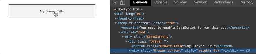
Right now if we ran the above code our component would load and display its title along
with any containing content. It would be shown by default and there wouldn’t be any styling
applied to yet (outside of browser defaults). Since we’re looking for some type of toggle on
showing the Drawer-content element above we’ll move onto working with our stateful variable active.
Since we need to toggle the state variable active whenever a user clicks the title, we can start by adding an onClick handler to the element. This will be the start of us fulfilling our first requirement, A clickable title that on click expands an attached content section.
// This negates the boolean for active which effectively toggles it between true and false
handleTitleClick() {
  this.setState({ active: !this.state.active });
}

render() {
  const { title, children } = this.props;

  return (
    <div className="Drawer">
      <div className="Drawer-title" onClick={this.handleTitleClick}>
        {title}
      </div>

      <div className="Drawer-content">
        {children}
      </div>
    </div>
  );
}
Now that we are toggling whether active is true or false, we can use the boolean
value to conditionally output specific CSS tyles on the top-level HTML element. This will give
us control over how the component looks when activated via our stylesheet.
render() {
  const { title, children } = this.props;
  const drawerStyles = this.state.active ? 'is-expanded' : '';

  return (
    <div className={`Drawer ${drawerStyles}`}>
      <div className="Drawer-title" onClick={this.handleTitleClick}>
        {title}
      </div>

      <div className="Drawer-content">
        {children}
      </div>
    </div>
  );
}
There’s a minor stumbling block at this point with the above setting of state. We’re using a negated form of the previous state !this.state.active to inform the current state what its value is. The problem is that state updates are batched meaning you can’t rely on them being immediate. To fix this we need to explictly use the previous state within the setState function.
setState() does not always immediately update the component. It may batch or defer the update until later. This makes reading this.state right after calling setState() a potential pitfall.
reactjs.org
We’ll use an arrow function here to select the previous state into a variable named prevState. This will allow us to be confident that the state change will be accurate.
handleTitleClick() {
  this.setState(prevState => ({ active: !prevState.active }));
};
Now our onClick handler properly deals with existing state.
However, the onClick handler can only update state by accessing the this context. Which means we’ll also need to bind it to this properly within the constructor.
constructor(props) {
  super(props);

  this.state = {
    active: false,
  };

  this.handleTitleClick = this.handleTitleClick.bind(this);
}
If you are using the experimental public class fields syntax, you can use class fields to correctly bind callbacks
reactjs.org
While this currently works, we can clean this up by taking it one step further using the public class fields syntax.
constructor(props) {
  super(props);

  this.state = {
    active: false,
  };

  // No binding necessary
}

// Instead of () {} is now = () => {}
handleTitleClick = () => {
  this.setState({ active: !this.state.active });
}
I really love how easy this syntax reads and how it cleans up your constructor function from all the binding cruft.
So with all that out of the way, we now have our first iteration of our component below.
import React from 'react';

class Drawer extends React.Component {
  constructor(props) {
    super(props);

    this.state = {
      active: false,
    };
  }

  handleTitleClick = () => {
    this.setState(prevState => ({ active: !prevState.active }));
  };

  render() {
    const { title, children } = this.props;
    const drawerStyles = this.state.active ? 'is-expanded' : '';

    return (
      <div className={`Drawer ${drawerStyles}`}>
        <div
          className="Drawer-title"
          onClick={this.handleTitleClick}
        >
          {title}
        </div>
        <div className="Drawer-content">
          {children}
        </div>
      </div>
    );
  }
}

export default Drawer;

/////////////////////////////////////
// And here's how you would use it //
/////////////////////////////////////
import React from 'react';
import Drawer from '~/components/Drawer'; // The location of our new component

class AnotherComponent extends React.Component {
  // code omitted
  render() {
    return (
      <div className="AnotherComponent">
        <h1>Welcome to my Clothing drawer</h1>
        <Drawer title="My Clothing">
          <ul>
            <li>Yellow Dress</li>
            <li>Red Skirt</li>
            <li>Purple Jacket</li>
          </ul>
        </Drawer>
      </div>
    );
  }
}
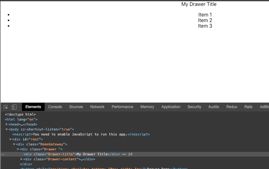
Here’s what it looks like so far. Really the only thing it does is provide
HTML structure and a toggleable CSS class called is-expanded based on state.
So far no one would want this on their website because it’s ugly. In the next section we’re going to add some SCSS styles to it.
Adding Style
One problem right now, is the drawer is basically always open. This means the Drawer’s content is always shown. We only want it to display if the state of the component is expanded. Just like a real drawer, we want to be able to open and close it to display the content as needed. We’ll be focussing on our requirement of Content section that animates like a drawer at this point.
We’ll use the component’s height attribute to close the drawer as eventually we’ll animate it using height. This will make the animation easier in the upcoming sections.
Start off by hiding the content (closing the drawer) using the following style configuration.
.Drawer {
  &-content {
    height: 0;
    overflow: hidden;
  }
}
We need both height: 0 and overflow: hidden here as they work in tandem. Having a
height of 0 continues to show the content. Adding overflow: hidden ensures that the content in the container outside of the height (using 0 here effectively closes it) will remain hidden. These two together close the content drawer.
Next we probably want the Drawer-title element to look like it is actually clickable. We can do this by adding a border, background, and cursor styles below.
.Drawer {
  &-title {
    background: #efefef;
    border: 1px solid;
    cursor: pointer;
    display: inline-block;
    padding: 16px;
  }

  &-content {
    ...
  }
}
The result is a primitive looking button to click. Which brings up something else we should probably fix at this point which is keyboard accessibility. We should be able to use the tab key to select the button and the enter key to activate it. Unforntately, we’re using a <div> meaning that right now this isn’t working. Time for a slight detour.
Keyboard Accessibility
One thing I recently learned about was accessibility of websites and applications. For example, anyone using a screen reader or other non-mouse assistance technology will be unable to use to our new button. This is terrible because the button’s action is integral to the feature being functional and we want to be sure we develop with everyone in mind. (Check out mozilla’s entry on general HTML accesibility here). One way we could attempt to fix this is by giving our Drawer-title div a tabIndex value and a role value.
We’re looking directly at our third requirement here which was, Screen reader compatible tab functionality.
<div
  className="Drawer-title"
  onClick={this.handleTitleClick}
  tabIndex="0"
  role="button"
>
  {title}
</div>
The above allows the browser to focus on the element making it the current element to receive keyboard events. However, the keyboard events for enter and spacebar don’t activate our onClick handler. Major bummer. We could try to add an onKeyPress event and capture the spacebar and enter key, but why do more than we need to when there is a perfectly semantic approach. The <button> element.
The eslint plugin jsx-a11y has some great documentation on the subject of non-semantic elements having an onClick handler.
ESlint jsx-a11y
So let’s fix this back in our render() method.
render() {
  const { title, children } = this.props;
  const drawerStyles = this.state.active ? 'is-expanded' : '';

  return (
    <div className={`Drawer ${drawerStyles}`}>
      <button
        className="Drawer-title"
        onClick={this.handleTitleClick}
      >
        {title}
      </button>
      <div className="Drawer-content">
        {children}
      </div>
    </div>
  );
}
As you can see from the above, we no longer need tabIndex, role, or even additonal events like onKeyPress. We can also remove the Drawer-title style for display: inline-block since buttons by default are inline-block.
At this point our button just works exactly how we would expect. Hitting the tab key on the page will focus on our new button. Once focused pressing either enter or spacebar will activate our onClick handler.
Now that we’ve ensure our drawer can be accessed by users with adaptive technologies, we can transition back to our goal of showing and hiding content in the Drawer.
Opening and closing the Drawer
Having converted our <div> style button above to a more semantic <button> element, we need to work on making its height change. Since the height of the element starts out as 0 we can simply have its height change to a larger value when the is-expanded class is active via the this.state.active variable. We want this value to be greater than the containing content’s height could ever be. I choose 40vh here as it is 40% of the current viewports height (and it seemed a reasonable starting place).
.Drawer {
  &-title {
    ...
  }

  &-content {
    height: 0;
    overflow: hidden;
  }

  &.is-expanded {
    .Drawer-content {
      height: 40vh;
    }
  }
}
Making the expanded state have a larger height tells to component to change dimenstions. Basically, mimicking the element opening and closing. We can make
this even more polished by adding an animated transition to the content. We’ll add transition: height .5s ease; to our content element style.
.Drawer {
  &-title {
    ...
  }

  &-content {
    height: 0;
    overflow: hidden;
    transition: height .5s ease;
  }

  &.is-expanded {
    .Drawer-content {
      height: 40vh;
    }
  }
}
Now that our Drawer-content section animates its height (from 0 to 40vh) our component is starting
to show off its basic functionality. With a couple more tweaks to the styles below, we’ve got our first iteration complete.
.Drawer {
  width: 300px; // Set parent width
  display: inline-block; // center the element

  &-title {
    padding: 16px;
    border: 1px solid;
    background: #efefef;
    cursor: pointer;
    width: 100%; // Make title button take up full width of .Drawer
  }

  &-content {
    background: #ddd; // Show a visible background
    border-left: 1px solid; // Add borders to all sides except top
    border-right: 1px solid;
    border-bottom: 1px solid;
    height: 0;
    overflow: hidden;
    transition: height .5s ease;
  }

  &.is-expanded {
    .Drawer-content {
      height: 40vh;
    }
  }
}
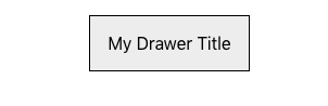
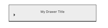
Here’s what our component looks like so far:

Static height and variable containers
While our component now functions well enough to open and close, there is a glaring issue with it. If you look back to our .is-expanded class we had to specify a static height of 40vh. This means that our container (which can contain a dynamic amount of content) will never have a height larger than 40% of the viewport. What if the content is larger than 40%? A lot smaller? Well the results aren’t great:
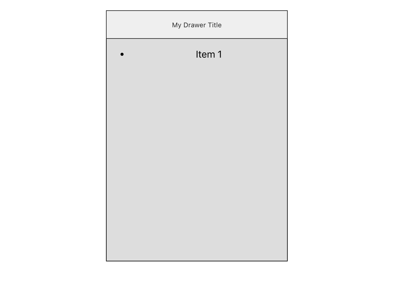
That’s a lot of extra space for a single list item! If you saw something like this online you might assume that whoever built it missed a step. Or possibly didn’t test it.
So how can we fix this? Well, unfortunately if you’re looking for a pure CSS solution here the short answer is, you can’t. Or at least all the articles I’ve read online claim there isn’t a process and I haven’t been able to figure one out either.
Really the only way to determine dynamic height for content is to calculate it using JavaScript. We’ll be calculating the space on-the-fly and adjusting as needed. So let’s do just that. Here’s our steps to follow to make this change:
- Remove static height from SCSS
- Calculate the height of the hidden content within the Drawer
- Set the height of the content to the calculated value when visible
Remove static height from SCSS
We’ll start by removing the static height from our SCSS. Since JavaScript will handle the ending height of the element based on the contained content, we no longer need to set a height on the element.
.Drawer {
  ...

  /* Remove all of this
  &.is-expanded {
    .Drawer-content {
      height: 40vh;
    }
  }*/
}
Pretty simple deletion of style code here. Let’s keep moving.
Calculate the height of the hidden content
Next we can calculate the height of the hidden element through some indirection based on the target of the click event. There’s a couple ways to accomplish this. Here’s the first approach:
handleTitleClick = (event) => {
  const contentHeight = event.target.nextSibling.scrollHeight;
  this.setState(prevState => ({ active: !prevState.active }), () => {
    this.setState({ contentHeight: this.state.active ? contentHeight : 0 });
  });
};
There’s a bit of added context above so let’s break it down line-by-line. First we’ll deal with calculating the hidden content’s height.
handleTitleClick = (event) => {
  const contentHeight = event.target.nextSibling.scrollHeight;
We added a new argument event that comes from the the click event. Using this we can check its target which returns the button’s DOM element. nextSibling grabs the next related DOM element which in our case is the Drawer-content div. scrollHeight gives us the element’s height and works with elements that are hidden via overflow.
The Element.scrollHeight read-only property is a measurement of the height of an element's content, including content not visible on the screen due to overflow.
mozilla.org
Next we modify our current setState call to accept a callback function. Using a callback function ensures that our first call to this.setState has finished meaning we can rely directly on any effected state variables again. We do this immediately to toggle our hidden content’s height via a ternary clause.
this.setState(prevState => ({ active: !prevState.active }), () => {
  // This second call to setState can rely on this.state.active directly
  // as the previous call must finish before this.
  this.setState({ contentHeight: this.state.active ? contentHeight : 0 });
});
Alright, so that’s the first attempt. Here’s a slightly updated one that is a bit more efficient.
handleTitleClick = (event) => {
  const contentHeight = event.target.nextSibling.scrollHeight;
  this.setState(prevState => ({
    active: !prevState.active,
    contentHeight: !prevState.active ? contentHeight : 0
  }));
};
The big change here is that instead of using a callback function with setState we’re relying on !prevState.active to let us know when the current stateful variable active is true. It’s a bit confusing given that we have to negate it with a ! but that’s because the state starts out as false and then becomes true upon clicking. Additionally, we can’t rely on this.state.active here because the update to it is happening at the same time (since they are both within the same setState call).
Setting the height of the content
Now that we’ve calculated the height of the hidden element, we can use that to directly apply an inline style. This part is actually pretty easy.
<div
  className="Drawer-content"
  style={{ height: this.state.contentHeight }}
>
  {children}
</div>
We use an object that contains camelCased CSS attributes as React requires this for dealing with inline styles. For example, if we were working with max-height we would instead write the attribute above like: style={{ maxHeight: this.state.contentHeight }}.
With this our component sets the hidden content’s height accurately.
The dangers of nextSibling
There’s still one piece of the above that’s bothering me. We’re finding the element to calculate height based on the following chain of method calls event.target.nextSibling.scrollHeight. What might happen if nextSibling doesn’t exist? Or if we change our component to include a new element between the button and the content? Future requirements might necessitate adjusting the component as we want to ensure it that works with any changes. Flexibility in crafting a component is key.
If nextSibling doesn’t exist then calling scrollHeight on undefined is going to raise an exception. On the flipside, modifying the component means the content element will no longer be targeted as the next sibling. For example, let’s say you needed an in-between content section to sit
between the title and the previous content like below:
return (
  <div className={`Drawer ${drawerStyles}`}>
    <button
      className="Drawer-title"
      onClick={this.handleTitleClick}
    >
      {title}
    </button>

    <div>In-between content section</div>

    <div className="Drawer-content" style={{ height: this.state.contentHeight }}>
      {children}
    </div>
  </div>
);
With the new <div>In-between content section</div> above we’ve broken our current height calculation. Now it looks like this:
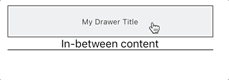
It turns out that our component isn’t very flexible to future changes.
We can fix this by using React Refs.
Using Refs for accuracy
Refs provide a way to access DOM nodes or React elements created in the render method.
reactjs.org
Refs allow us to accurately target specific DOM element within the render() function. In our
case, being able to target the content div via a ref is going provide greater flexibility to future changes and will be less brittle. Here’s how you would implement it:
constructor(props) {
  super(props);

  this.state = {
    active: false,
    contentHeight: 0,
  };

  // Here we add a new Ref to the current object
  this.contentRef = React.createRef();
}

// No longer pass in 'event' as a parameter since it isn't needed
handleTitleClick = () => {

  // We can now use our newly defined ref from the render function below
  // to accurately grab the DOM element.
  const contentHeight = this.contentRef.current.scrollHeight;
  this.setState(prevState => ({ active: !prevState.active, contentHeight: !prevState.active ? contentHeight : 0 }));
};

return (
  <div className={`Drawer ${drawerStyles}`}>
    <button
      className="Drawer-title"
      onClick={this.handleTitleClick}
    >
      {title}
    </button>

    <div>In-between content section</div>

    <div
      className="Drawer-content"
      ref={this.contentRef} // Here we attach our new Ref to the element
      style={{ height: this.state.contentHeight }}
    >
      {children}
    </div>
  </div>
);
Let’s go through the above line-by-line. First, we create an empty ref object within the
constructor. The allows us to supply this property to a React DOM element within
the render() function.
constructor(props) {
  // omitted code

  this.contentRef = React.createRef();
}
Next we’ll set our .Drawer-content container to use the new Ref.
<div
  className="Drawer-content"
  ref={this.contentRef}
  style={{ height: this.state.contentHeight }}
>
Finally, we need to modify our onClick handler to account for the new Ref. It will use
the ref to properly target our element consistently for any future changes.
handleTitleClick = () => {
  // We use the Ref below and specify the `current` property which returns
  // the Refs DOM element.
  const contentHeight = this.contentRef.current.scrollHeight;
  this.setState(prevState => ({ active: !prevState.active, contentHeight: !prevState.active ? contentHeight : 0 }));
};
And there you have it. One fully-functional Drawer component utilizing Refs instead of relying on brittle DOM selection. Nice work!
Expanded state and styling
Remember our is-expanded class above? We’re technically still adding/removing
it based on the state of active but right now it doesn’t do anything. It’s still nice to keep the functionality as it let’s the front-end know the state of the component for styling purposes. We can use this to
give our Drawer component a bit more flash by providing a simple triangular
indicator to signal if the Drawer is expanded or collapsed.
First we’ll add a new element to our render() function that will contain our arrow indicator. We’ll
also surround the displayed title inside the button with a <span> tag. This will come in handy
for alignment in a minute.
<button
  className="Drawer-title"
  onClick={this.handleTitleClick}
>
  <span className="Drawer-titleText">{title}</span>
  <div className="Drawer-arrow Drawer--rightArrow" />
</button>
Now that we’ve added an element to style let’s make it look like an arrow. You could use SVG here but we can just as easily do this in CSS. Chris Coyier of CSS-Tricks has an excellent article on how this works. I highly recommend a read through.
Here’s the CSS we’ll need to achieve the effect:
.Drawer {
  $arrowSize: 5px;

  &-arrow {
    border-top: $arrowSize solid transparent;
    border-bottom: $arrowSize solid transparent;
    border-left: $arrowSize solid #454545;
    width: 0;
    height: 0;
  }
}
A quick explanation of the above:
- We set the element to have
heightandwidthof 0. This is because adding a border to a 0 sized element makes the borders meet at the center of the element like a triangle. Acting like a right angle that is centered in the middle of the element. border-topandborder-bottomare set to transparent to hide the top and bottom of the triangleborder-leftadds a border on the left side but because it is triangular it appears to be pointing to the right.
We’ve now got a triangle indicator but it isn’t positioned properly as seen above. Let’s move this to the right side of the button using Flexbox.
- First we’ll give the parent element
.Drawer-titlethe property ofdisplay: flex. - Then we’ll set the actual title text element above to flex as much as possible using
flex: 1. - Finally, a small tweak to our arrow by using
align-self: centermake it appear on the same baseline as the bottom of our text characters. Here’s the resulting CSS:
.Drawer {

  &-title {
    // omitted

    display: flex;
  }

  &-titleText {
    flex: 1;
  }

  &-arrow {
    border-top: $arrowSize solid transparent;
    border-bottom: $arrowSize solid transparent;
    border-left: $arrowSize solid #454545;
    width: 0;
    height: 0;

    align-self: center;
  }
}
We can take one more step and animate this alongside the content animation. This will give the appearance of the triangle twisting downward making it look like the drawer is expanding.
.Drawer {

  &-arrow {
    border-top: $arrowSize solid transparent;
    border-bottom: $arrowSize solid transparent;
    border-left: $arrowSize solid #454545;
    width: 0;
    height: 0;

    align-self: center;
    transition: all .5 ease;
  }

  &.is-expanded {
    .Drawer-arrow {
      transform: rotate(90deg);
    }
  }
}
And here’s our final iteration for this article:
Wrapping up
So running through what we accomplished above here’s what we’ve produced:
- We created a new component that has a onClick event to set a CSS class
- We’re calculating the hidden content’s height in JavaScript
- Using CSS we’ve hidden our content drawer, animated the height change, and created a triangle.
If you’d like to see a full versions of the code above, I’ve condensed it here.
I’ll be writing a follow-up article to this one explaining how we can convert the above into a Compound Component for better Composition. As always, thanks for reading.
Using callback functions with setState in React
Invalidate requests when a user session contains null bytes in the Rack layer
Join the conversation